Colour Selections – Round One

I’m still recovering from the marathon that was our colour and electrical selections appointment. What a day!

I’d read enough blogs and Homeone forum threads to know that for a successful, straight forward, stress-free colour appointment preparation was key! With 6 months lead time and plenty of idle time, I had a plan to be as organised and prepared for the day as possible.

  • I visited Studio M many times to window shop Metricon’s range so I had a fairly good idea of the items we’d be upgrading.
  •  I requested a few Display Option List (DOL) to get an idea of costs of the non-standard items you see in the display homes. Based on the prices, I worked out an estimate and set aside a provisional allowance to spend at Studio M.
  •  We had an appointment with the builder’s external kitchen consultant to re-design the kitchen to our personal taste.
  •  I hired an interior designer to help pre-select colour schemes for the house.

So, I felt confident that I had things under control. Well suffice to say the appointment didn’t exactly go as planned. Perhaps I shouldn’t really be surprised given every stage of this admin phase has thrown a curve ball!

The plan came unstuck when selections started on the kitchen and butler’s pantry. As we customised the space, Metricon was provided a supply and install quote by the external kitchen supplier. When we met with the kitchen consultant, we had given him the budget we allocated for the redesign. He assured us that the changes he made would fit within that budget. Imagine our shock when Metricon gave us a lump sum price of roughly $16,000 for our non-standard kitchen and butlers pantry. We were hoping to have the dream kitchen for $10,000 😢

To give some context, here are the elevation drawings of the offending rooms…

IMG_3758.JPG

Standard Metricon Hudson Kitchen and Pantry

IMG_3749-0.PNG

Customised Kitchen and Butler’s Pantry

I don’t think we went overboard with the changes to the main kitchen. I expected the variation to the pantry was going to be the bulk of the extra cost and worked out a guesstimate of the redesign based on Metricon’s DOL.

  • Increased the island from 2696mm x 1020mm to 3000mm x 1200mm – $1,000
  • Increased the caesarstone edge to island only from 20mm to 40mm. The main kitchen bench top to remain standard 20mm. –  $1,000
  • Added a microwave/oven tower – $1,590
  • Added 2 banks of drawers – $1,620
  • Deleted 3 base cupboards Elevation D of the island – (expect a credit)
  • Deleted standard pantry shelves and replaced with a customised butler’s pantry layout including caesarstone bench top and base cupboards – $5,000

I’m well aware of builder’s margin but the price discrepancy seems unreasonable and for the life of me I can’t do the maths! I guess I have to wait for the itemised breakdown from Metricon to work out the extra charges. It’s fair to say, we left the appointment frustrated and disheartened. We now have a huge task of trying to cull the upgrades to get within budget! *Sigh*

Colour Pre-Selections

via piccolor.com

via piccolor.com

Happy Spring everyone!

I’m so excited by the change of seasons and the onset of spring seems to have set the wheels back in motion. While the development application awaits its turn in the council queue, we now shift our focus on the enormous task of selecting all the internal finishes for the house.

As I mentioned in this post, the multitude of choices has left us a tad overwhelmed with indecision! Although Nick and I have similar tastes, it’s no surprise that there are some colour conundrums that we struggle to agree on. To preempt the inevitable squabbles we decided to hire an interior designer to help us perfect our colour schemes and make sure the choices we make not only look stunning but also complement our lifestyle.

So, off we went on a 3-hour colour therapy with our interior designer extraordinaire Jenny. The plan was to meet at the Di Lorenzo showroom to pick tiles for the wet areas then head off to Studio M to choose the benchtop and vanity materials to finish off the colour schemes.  Under Jenny’s expert guidance, we nailed the colour selections for all bathrooms, kitchen and laundry, and chose the interior paint colour for the walls, ceiling, cornices, architraves and skirting boards. No doubt it would have taken us far more time and effort on our own. It should now make next week’s colour appointment with Metricon a breeze!

Apologies for the poor quality photos. The lighting in the showroom was not ideal. Anyhow with these bathroom ideas in mind, here are the colours we decided on.

KITCHEN
Benchtop: Caesarstone Organic White
Overhead Cupboards: Laminex White Natural Finish
Underbench Drawers: Laminex Smoky Sapelle Silk Finish

Kitchen Colour Scheme

Kitchen Colour Scheme

POWDER ROOM
Benchtop: Caesarstone Walnut
Vanity: Laminex White Silk Finish

Powder Room Colour

Downstairs Powder Room Colour Scheme

ENSUITE
Benchtop: Caesarstone Wild Rice
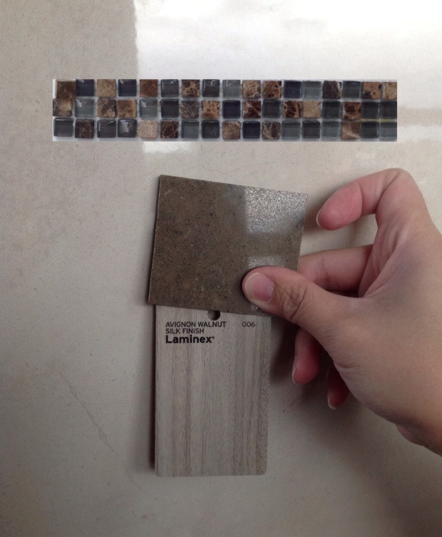
Vanity: Laminex Avignon Walnut Silk Finish

Ensuite Colour

Ensuite Colour Scheme

KIDS BATHROOM
Benchtop: Caesarstone Linen
Vanity: Laminex Milano Walnut Natural Finish

Kids Bathroom Colour

Kids Bathroom/Upstairs Powder Room Colour Scheme

We are very pleased with our selections and can’t wait to see them come to life!

Glimpse of the facade

The journey to building our dream home started over 3 years ago. It started with countless weekend expeditions to HomeWorld visiting one display home after another. Right from the get go, Metricon had impressed us with their beautiful contemporary designs. The Laguna was at the top of our list until we saw a video showcasing the Hudson.

It was a leap of faith making the decision to build a design based on the floor plan, image gallery and a video. It would have been ideal to visit a display home to get a feel of the space but unfortunately the Hudson is not on show in NSW or anywhere else in Australia. Well it sure looks beautiful in the photos and video so if ours end up half decent then I’ll be one very happy camper.

I’m a visual person and I’d been dying to see how our modified facade and chosen colours would look like together.  My dabbling in SketchUp has been an epic fail and the closest I’d come to getting an image of the front elevation is through Envisage. Not exactly the same facade nor the colours but close enough to get a glimpse of how well or not so well the colours complement each other.

via Envisage

via Envisage – based on Kingston  Facade

so, imagine my excitement when I stumbled upon an Australian e-business that produces architectural visualisations. NewHomeVisuals specialise in creating 2D elevation plans and photographic images at very affordable prices. The products, textures and colours are the exact match as specified by the suppliers. I put my order in quick smart and in less than 24 hours I had the elevation visual delivered straight to my inbox. Talk about a quick turnaround!

Seeing the facade mock-up, I’m starting to second guess our colour selections. The cladding painted in Dulux Saudi Sand looks particularly different to the live sample. On the monitor, it looks  a lot darker and more brown than I’d envisaged.

Our Hudson

Our Hudson Facade via New Home Visuals

We were inspired to use the cladding colour by the render on this Metricon display home. It’s painted in Saudi Sand and this is the shade we hope ours to come up in real life. Time will tell.

Render in Dulux Sand

Render in Dulux Saudi Sand

I wish I’d known about this service before the exterior colour appointment. With our plans on the verge of council submission, I don’t think I should be making any changes or I run the risk of  incurring the husband’s wrath.

Colour me happy

The interior colour selection is perhaps the most exciting and anticipated stage in pre-construction. Think of it as one massive shopping spree! We have half a day to pick doors, architraves, cornices, staircase, taps, wall and ceiling paint colour, bench tops, vanity cabinets, bathroom accessories, splashbacks…you name it.

Studio M selections

Studio M selections

I have a fairly good idea of the style and look I want for our home. I love clean, sleek lines and white, neutral colours with wood accents. In Metricon’s book, my style is closest to Wall Street. I want the interiors to be simple, spacious, stylish yet functional and organised especially with three very active and messy children. I want our home to look beautiful but more importantly to work with our lifestyle.

So, now that I’ve narrowed down the overall style it should be pretty easy to choose the colour and finishes right? Wrong!

The myriad of choices is a wee bit overwhelming! 

I have a bad case of analysis-paralysis. Whilst the internet is a godsend for information at the fingertips, it’s also proving a great source of indecision.

Can’t decide on the flooring colour. I love the contrast of dark timber floors and white walls but I’m also practical and hate cleaning. I’m worried how they will look when not clean. I think lighter coloured floorboards will be more forgiving and won’t show up the dirty footprints and smudges? What do you think?

Dark floor

Dark floor

Not so dark

Not so dark

The colour scheme for the kitchen is also giving me pause partly because my husband has put his two cents in about his dislike for a white kitchen. He thinks white is too clinical and prefers a timber veneer look in oak or chestnut. I personally don’t dislike this look hence the dilemma.

Chestnut timber veneer

Chestnut timber veneer

I think it may come down to the floor colour we end up with. If we go dark floorboards, a white kitchen will look smashingly beautiful.

White kitchen

White kitchen